

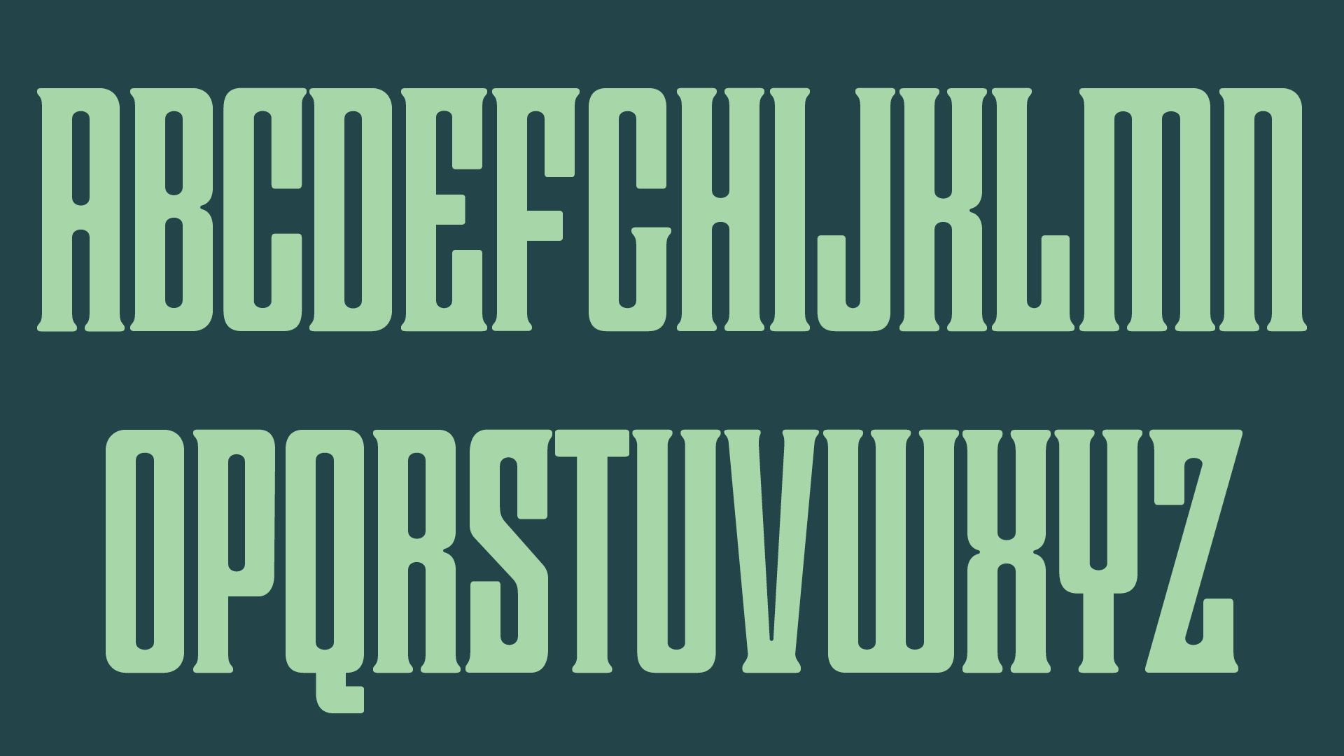


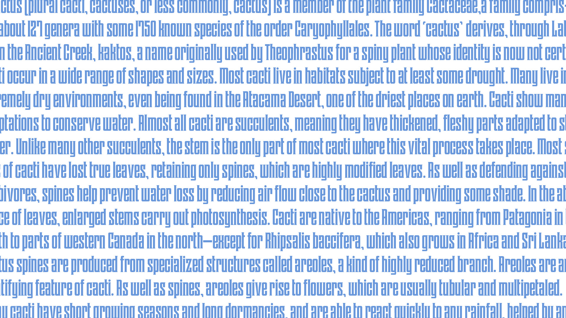


A narrow display typeface with hardly any sharp edges, constant verticals, and a lot of curves.
When I initially started designing this typeface, it was a revival of a metal face named Herald from the T.J. Lyons Collection. Herald however was much more sharp edged, and irregular. In the processes of moving little anchor points around to make this, I found myself gravitating a lot more towards softer rounded curves. For Cactus, I focused more that soft quality while emphasizing a strong elongation of the letterforms. Even though there is a lot of roundness, there are no big curves. This typeface is named Cactus because of the cacti-like counter forms and negative spaces between letters.